
I'm posting this as an REVEALED post instead of as a Cover Crazy because, well, I'm not sure how crazy I am just yet! But in person, it may quite possibly be stunning!
 |
| Click image to view full-size! |

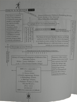 |
| WITHER's Copyright Page! Even this has incredible design! |
While I'm not a fan of that shade of green (especially with all the green in the image that's blending in), colors often look different in final form. It's amazing to see how different the model looks in this image compared to the first two. Plus, she looks...happy? So that's something! The bird may not be the same one from the first cover, but it's free now, which is saying a lot. Her white dress symbolizes purity and freedom, too, plus she's holding her wedding ring in her hand (And her hands look empty if you're looking at a smaller version of the cover, I know).
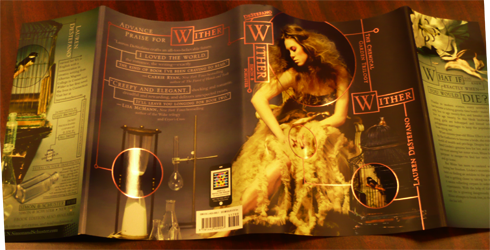
I always like how MUCH is going on in these covers and always want to know more about the individual objects lying around. This series still has one of my favorite cover/interior treatments for font and design.
I have to say, however... I still like the original jacket the best of the three:
Wow, I'm gone for a while from the bloggy world and a ton of stuff happens!
ReplyDeleteI'm not a fan of that cover either, I think the green is horrible! Wither's was so much better. I need to read Fever first.
I need to catch up on a lot of reading!
I know, right? The world completely exploded! Glad to have you back. WITHER is my favorite of the three, but also one of my all-time favorite covers, so the other two never could live up...
Deletei hate to judge a cover having not read the book... which is true for the entirety of this series, but on sheer aesthetics, i completely agree with you on wither being the best. the emotive pose, the geometric embellishments, the objects...
ReplyDeletewhile, i'm hoping there is genuine reason in the story for this cover... it comes across as a poor attempt to echo the other ones. and the "green screen" look behind her makes it look as though someone threw a lot of junk in a studio, had a girl in a pretty dress sit there stiffly, clicked a photo... and... kinda left that background. i sure hope you're right and it'll print out looking differently...
or perhaps before it goes to print someone will darken and desaturate that green a bit... it wouldn't look bad if they could just do that.
Whhhat, you never read WITHER? Hopefully someday, Vic!!
DeleteWe'll see how closely the book ties in with the cover when it releases. I remember all the flack over FEVER and saying the cover was crazy and weird and drugged out and it actually matched the content really well, so who knows. I really hope it prints differently or gets re-adjusted...
I could not put this book down! It was excellent! It didn't disappoint with no lack of action and it ended with such an unexpected twist. Can't wait to read the next book!
ReplyDeleteCleo Rogers BitDefender Internet Security Software Download