

Cover Crazy is hosted by The Book Worms. Each week, bloggers "admire the art and beauty of a book’s design, so I’m going to post minimal words. It is up to you to write how you feel and what you like about it the way you’d like to."
Yesterday, I saw a reveal of the UK cover for Cynthia Hand's debut novel, Unearthly. You might remember how much I loved this book when I slobbered all over it in my review earlier this year. I wasn't expecting to like it much at all, but I LOVED it! So you should all read it. :)

Why I Love This Cover:
Clara looks so ethereal here, doesn't she? This cover makes her look truly "unearthly," a visitor among us. Even the typeface for the title is glowing. I love the way everything is pure white, from the dress that reminds you of times long past to the billowing hair to the sheen of her skin. It's absolutely gorgeous.
In fact, I'm having trouble deciding which cover I like the most! Cynthia Hand truly won the cover lottery:
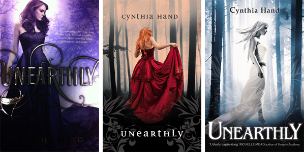
Which one is your favorite? I can't decide! I love the US cover b/c it's purple and silver and beautiful in person (there's a little too much color in my photograph, but eh, what can you do?). Clara also looks the most normal here, which matches the fact that she's an ordinary girl. The Australian cover--I want that dress! That dress is GORGEOUS! (And those swirls look even more awesome in person.) But the UK cover is just so out-of-this-world and I keep being drawn back to it. I love the fact that all three covers are so connected despite looking very different from one another. There is a forest background in all three. I also noticed that Clara never has the same color hair--AND not one cover got it quite right.
My hair is my best feature, long and wavy, bright gold with a hint of red, trailing behind me wherever I go like an afterthought. The problem with my hair is that it's also completely unruly. It tangles. It catches in things: zippers, cardoors, food. Tying it back or braiding it never works. It's like a living thing trying to break free. Within moments of wrestling it down, there are strands in my face, and within the span of an hour it usually slides out of its confines completely. It takes the word unmanageable to a whole new level.
(pg. 14, US edition)
Hand has such a vivid description for Clara's hair that none of these images quite match up. All of the girls are too perfect-looking. In Chapter Two, Clara's hair starts to shine as she comes into her powers, becoming "an iridescent silvery-gold riot of light and color. It blazes. It catches the light like a mirror reflecting the sun" (pgs 30 - 31). She's forced to dye it until she can control herself and "My hair turns out orange. Like a peeled carrot" (pg. 36).
Of the three, the Aussie edition probably comes closest, but that gorgeous mane of hair doesn't look like a dye-job gone wrong to me!
Even if none of the models quite look like Clara, I still LOVE all three designs. If I was the type of person who owned multiple copies of books in various editions, I'd proudly display every single one of these on my bookshelf!
I can't WAIT to see what Hallowed will look like when the cover art for Hand's second book is finally revealed!
[Unearthly is available now, depending on what country you live in! Definitely the US/Canada and Australia. I'm not sure if it's currently available in the UK and getting a new cover, or on its way for the first time!]
I like the US cover... But the Aussie cover is fabulous too!
ReplyDeleteI am drawn to the Aussie cover. I like the red dress, it really stands out. Also like the contrast it has with the greys. My favorite aspect is the scene.
ReplyDelete*squees* Oh you don't know how much I love the UK cover! So gorgeous :)
ReplyDeleteI'm not into books about mermaids but I might check this one out. The cover is beautiful.
ReplyDeleteMy favorite is still the US cover, though I don't really like the hologram look it has in person. She looks the most like Clara to me, and I can pretend her hair color is correct because the whole cover is purple.
ReplyDeleteThe new UK cover really is striking. She does look very unearthly, but she's not really *my* Clara.
I LOVE all three covers, they're all stunningly beautiful :) I don't think I could decide and if I were to order a copy and decide which cover I want I would most likely end up ordering all three :)
ReplyDeleteCheers!
Wow! The UK cover is gorgeous! Well, they all are. :) I hadn't seen the UK one before. I love it.
ReplyDeleteJennifer of Little Shelf
Response to comment: hehe great minds think a like!
ReplyDeleteThey are all so pretty in different ways, but I do like the US cover more because she resembles the Clara in my head.
i would say that i loved the one with the red dress more... i just loved how the color blended well with the background. it's so eye catching and the dress is so gorgeous.
ReplyDeleteOh wow! Love love love all three covers now!!!
ReplyDeleteOh my goodness!! You were right!! These covers are phenomenal!! SO incredibly lovely!
ReplyDeleteI think all of these covers are gorgeous. Nice choice!
ReplyDeleteReading Lark's Cover Crazy