
I promised you guys that I would post pictures of the Wither marketing display, and I always keep my word. Plus, I wanted you all to see just how beautiful the real cover is! I should have posted Friday, but I got sick. Boo. I'm almost better now, but between my cold and the fact that I sprained my ankle earlier in the week, I'm no longer going into NYC for the conclusion of the NYC Teen Author Festival. This seriously depresses me. I was looking forward to going to Books of Wonder and listening to all those fabulous authors (esp. Sarah Beth Durst!). Boo, boo. Oh well, always next year. Wasn't meant to be this time around. Have fun if you go! Can't wait to hear all about it!

It's HUGE. Very tall. While the corrugated display isn't as striking as the cover held within its shelves, I must say, I like the way they focused on a tree. Trees are important in Wither. Plus, if literature classes have warped your brain to the point where you see symbolism in everything, you'll also be focusing on that sole, barren, desolate, empty tree... *coughs* AHEM!
But you want to see the gorgeous cover, yes? Yes!

The pink isn't so cotton candy in the final product, which makes me even happier with the design. It's sultry and metallic; this color brings out her eyeshadow even more! Plus, with the final cover art, you can see that the stunning front photography continues through to the back cover, revealing even more imagery and symbolism than previously notated. Plus, even the inside flaps are gorgeous! This cover seriously makes me swoon. One of the best teen covers (imo)! Books two and three need to top it though, yes? Can't wait to see!
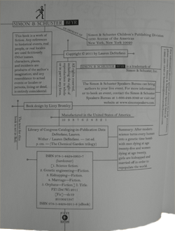
Finally--and I don't know if this was there in the ARC and I overlooked it or a final design change--even the copyright page is using the boxed-in design and it looks AMAZING:

This book just amazes me more and more...
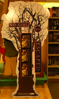
It's HUGE. Very tall. While the corrugated display isn't as striking as the cover held within its shelves, I must say, I like the way they focused on a tree. Trees are important in Wither. Plus, if literature classes have warped your brain to the point where you see symbolism in everything, you'll also be focusing on that sole, barren, desolate, empty tree... *coughs* AHEM!
But you want to see the gorgeous cover, yes? Yes!
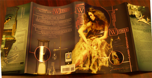
The pink isn't so cotton candy in the final product, which makes me even happier with the design. It's sultry and metallic; this color brings out her eyeshadow even more! Plus, with the final cover art, you can see that the stunning front photography continues through to the back cover, revealing even more imagery and symbolism than previously notated. Plus, even the inside flaps are gorgeous! This cover seriously makes me swoon. One of the best teen covers (imo)! Books two and three need to top it though, yes? Can't wait to see!
Finally--and I don't know if this was there in the ARC and I overlooked it or a final design change--even the copyright page is using the boxed-in design and it looks AMAZING:
This book just amazes me more and more...
Aw, sick and a sprained ankle! I feel so badly for you :( Wishing you speedy recoveries.
ReplyDeleteThanks for sharing all those pictures of Wither. I love when publishers put so much detail into the appearance of a book.
ive said this before but yeah...SO PRETTY!<3
ReplyDeleteThis comment has been removed by the author.
ReplyDeleteI have to agree with you - Wither has one of the most stunning covers I've ever seen. The whole book is a work of art - the cover, the pages, and thanks to Lauren, even the words. I received a signed ARC copy so while I'll treasure it since it's been signed, I am definitely getting a finished copy. Preferably hardcover because that jacket flap is so beautiful.
ReplyDeleteAww and I hope you get better soon! :( *hugs*
@ Small Review: I know, right? It all comes at once. Thankfully, I'm feeling much better (and sturdier) today, so I'm hoping to feel even BETTER tomorrow. Especially since I haven't written all week due to being sick. I'd love to snuggle up with my notebook before work tomorrow...
ReplyDeleteI know, right? I LOVE when publishers have such an amazing marketing plan in place. It gets notice and the book really takes off! I've never seen anything as well-designed as Wither. One of my art teachers once pointed out my final project for being the only one that looked like every area had been touched. I'm not the best artist; I was out of my league in that class. My picture was NOTHING compared to everyone else's. But every spot had been touched. Wither feels like that to me.
@ Aleeza: I know! So pretty! *ooh, shiny!*
@ Brodie: I am so in love with Wither on a whole. The book looks gorgeous inside and out. I want to marry DeStefano's graphic designer, lol. Plus, yes, the words are also gorgeous. You're sucked in from page one.
I'm like you--even though I have an ARC, this is one book that NEEDS to sit on my bookshelf in finished form. I didn't even realize the back and flaps looked like that until I saw it in person! STUNNED.
Aw, thanks! *hugs back* Today felt better. I didn't need tissues, mostly. The cold has swept through me pretty fast. Here's hoping for a better tomorrow!
I saw your comment at Elana's, so I thought I would stop by to follow your blog.
ReplyDeleteNice ta meet ya!
I love this cover.
Thanks for stopping by, Matthew! I'm so glad you found me through Elana <3
ReplyDeleteI hope you enjoy your stay here!